 Mastadon
 Feeds
Feeds Contribute
Building an Android equivalent to the iPhone toolbar

As is the case with some of my previous Android posts the hard work was done by Nick Maher as he ported his acclaimed Sydney timetable app (TripView) to the Android platform.
I just finished porting my trilogy of history apps to Android. I had some initial issues finding a good alternative to the iPhone's paged UIScrollView, but once that was sorted I needed to decide how I was going to present shortcut functions in the UI.
On iPhone the choice was obvious. You create a UIToolbar and add some UIBarButtonItems to it. Easy to build and the stock standard iPhone UI is consistent and looks great.
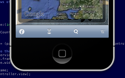
On Android there isn't such a clear cut choice. If you want to use 'out of the box' code in the SDK, you are kinda out of luck. You could stick the toolbar like features in a menu. But in that case the user needs to click the menu button, then click the common function. Not really ideal, two clicks instead of one and, to me at least, the menu feels like something that has survived from the J2ME days.
I have been to a couple of Google events and the presenters have been fairly vocal about building user interfaces that people like to use. They have posted video's with design pattern recommendations that address this particular problem. The speaker in this talk suggests a 'action bar' for commonly used, app wide functionality. This makes perfect sense and looks great in the presentation slides. Unfortunately there isn't a UIToolbar like object built into the SDK that makes this easy for developers to build.
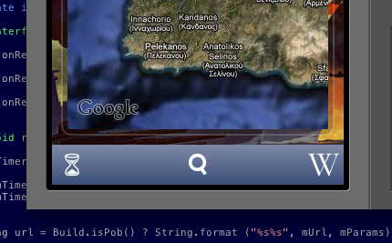
XML layouts make building UI in Android a pleasure and it is actually pretty straight forward to build something that looks like the iPhone toolbar. First you need to define a relative layout in the layout for the activity with the toolbar (N.B. I refer to a couple of image drawables in this first snippet, you just need to replace them with your toolbar button images):
<RelativeLayout android:id="@+id/toolbar"
style="@style/Toolbar"
xmlns:android="http://schemas.android.com/apk/res/android">
<ImageButton
android:id="@+id/date"
style="@style/ToolbarButton"
android:src="@drawable/hourglass"
android:text="">
</ImageButton>
<ImageButton
android:id="@+id/search"
style="@style/ToolbarButton"
android:src="@drawable/search"
android:layout_centerHorizontal="true"
android:text="">
</ImageButton>
<ImageButton
android:id="@+id/wikipedia"
style="@style/ToolbarButtonRight"
android:src="@drawable/wikipedia"
android:text="">
</ImageButton>
</RelativeLayout>
Then you need to add the styles used in the previous layout to styles.xml in the values res directory:
<resources>
<style name="Toolbar">
<item name="android:layout_width">fill_parent</item>
<item name="android:layout_height">44sp</item>
<item name="android:background">@drawable/toolbar_background</item>
</style>
<style name="ToolbarButton">
<item name="android:layout_width">44sp</item>
<item name="android:layout_height">44sp</item>
<item name="android:layout_centerVertical">true</item>
<item name="android:scaleType">center</item>
<item name="android:background">@drawable/toolbar_background</item>
<item name="android:tint">@color/toolbar_fg</item>
</style>
<style name="ToolbarButtonRight" parent="@style/ToolbarButton">
<item name="android:layout_alignParentRight">true</item>
</style>
</resources>
The Toolbar and ToolbarButton styles refer to the toolbar_background drawable. This is the guy that defines the look and feel for the toolbar items (this goes in toolbar_background.xml in the drawable directory).
<selector xmlns:android="http://schemas.android.com/apk/res/android">
<item android:state_pressed="true">
<shape android:shape="rectangle">
<gradient
android:startColor="@color/highlight_top"
android:endColor="@color/highlight_bottom"
android:angle="270">
</gradient>
</shape>
</item>
<item android:state_focused="true">
<shape android:shape="rectangle">
<gradient
android:startColor="@color/highlight_top"
android:endColor="@color/highlight_bottom"
android:angle="270">
</gradient>
</shape>
</item>
<item>
<shape android:shape="rectangle">
<gradient
android:startColor="@color/toolbar_top"
android:endColor="@color/toolbar_bottom"
android:angle="270">
</gradient>
</shape>
</item>
</selector>
There are some colour definitions that define the nice iPhone-esq gradient on the toolbar_background drawable, so we will need to add those to colors.xml in the values res directory as well.
<resources>
<color name="toolbar_top">#ff7d88a5</color>
<color name="toolbar_bottom">#ff3a4e78</color>
<color name="highlight_top">#ffffc600</color>
<color name="highlight_bottom">#ffcf9600</color>
<color name="toolbar_fg">#ffffffff</color>
</resources>
So you just need to hook up your View.OnClickListener for each of the button ids:
findViewById(R.id.date).setOnClickListener(this);
findViewById(R.id.wikipedia).setOnClickListener(this);
findViewById(R.id.search).setOnClickListener(this);
Then do your thing in the handler:
public void onClick(View view)
{
if (view.getId() == R.id.date)
// ... you get the idea
That's it.
You can see from the first question in this presentation that developers want this stuff built into the framework and it is pretty clear that Google wants to do this, so hopefully this post will be made obsolete soon and this stuff will be available as stock framework objects.
Permalink - Tags: Development,Android,Google